Contents
1. Preface
 |
Q'apla! My name is Webmaster, and this is my website, the Star Trek
Dimension. According to its name, the site includes all aspects of Star Trek, all series,
feature films, background material and and is directed to both the "Star Trek
beginners" and "hardcore trekkers". Of course, such a huge project, which
is also supposed to be a forerunner concerning web design and Star Trek art, requires much
time, talent for organization and finally also much patience in view of writing texts
around the nice pictures and diagrams and provide some substance beside an exciting
design.
On July 31st, 1999, the first files were uploaded to the server with the virtual domain www.stdimension.de, and on August 2nd, the website
was officially opened, not too much time ago. Nonetheless - the whole project Star Trek
Dimension is much older. For two years, the LCARS database, the "heart", was put
up, and the idea of a hyperlinked, thematically structured multimedia database with
extensive information on Star Trek, that I have realized in numerous predecessor projects,
dates back even more years. |
| However, since the Star Trek Dimension
is online, the project grows exponentially. The former 25 MB LCARS database, which was
uploaded in early August 1999 with a front page and a few "frame files", have
turned to 95 MB database, Star Trek Cartography, Sound Dimension, episode guides, Media
Library and many other projects - within one year. The amount of data which has been
created during this time - screen shots, scans, internet pictures, sound and video files,
but also self-created diagrams, photos and 3D models, is incredible. and exceeds the
amount that is actually avaible on the webserver by factor one hundred. These files
illustrate the hundreds of hours I invested again in the website since its online launch,
and to a large extent, they shall speak for themselves in the following Making Of. Join
the voyage in pictures through the time before and after the online launch of the Star
Trek Dimension, and its projects. |
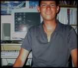
Ein kreativer Arbeitsplatz?!
|
2. The predecessor projects
The computer encyclopedias
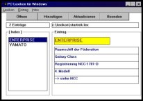
My first attempt to create a digital
encyclopedia, as of 1994, with not more than 2 entries.
|
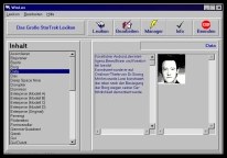
The version of 1995 has a considerably
better-looking interface and more than a hundred entries.
|
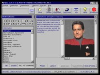
1996: the last version of the computer
encyclopedia, which was superseded by my web project shortly afterwards.
|
The web project Star Trek Dimension may be only one
/ three years old, however, already since 1994 - since I'm a "real" Star Trek
fan - I have tried to apply my computer abilities profitably, i.e. I have done what many
fans have done before and attempted to create an encyclopedia for my own purpose, that
should be more extensive than the sole Star Trek book avaible in German at that time - the
"Trek Encyclopedia" by Thomas Maxwell. Amazingly, I never tried this in the
traditional way (perhaps because I belong to the generation @), but I have written own
programs which my encyclopedia was based on. Naturally, at that timeI didn't have the
abilities I have today, neither concerning programming nor design,
but the extension and design of my "products" improved in the course of time.
| |
|
|
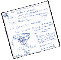
Facts about Star Trek IV as of 1995 with
"professional" drawings
|
Although basically, I
elaborate everything with and for the computer, the basics remained on a conventional
media: information on the various episodes, warp calculations, ideas and thoughts were
written on hundreds of (pieces of) paper of any size and colour. |
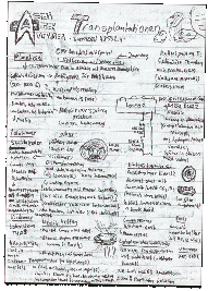
Episode facts about [VOY] Phage as of 1996
|
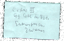
A note about Cestus III that was decisive for the position of the planet on the
"Map of Local Space".
|
Although since 1998,
I electronically capture even episode facts, I still have bits of paper everythere ... |
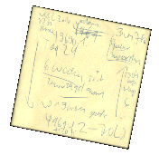
Extensive stardate calculations for "The journey of the USS Voyager".
|
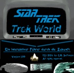
TrekWorld - the predecessor of the Star Trek Dimension
| Two years before I
started to program in HTML, in early 1995, I had developed the conventional encyclopeia to
a parallel, more ambitious project: I wanted to put up a thematically structured,
hyperlinked multimedia database, and for this purpose, I had even written a suitable
program that I improved until September 1997. In fact, this project "TrekWorld",
which had a similiar structure to the later LCARS database, was the immediate precursor,
and some of the texts were directly reused in the LCARS files (mainly the ship database). |
|
|
|
|
|
|
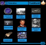
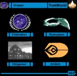
The first version as of 1995, which was exclusively based on pictures from CDs and
grayscale-scans. |
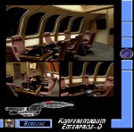
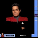
Sadly, the projects remained experimental, and
although nearly one thousand picture collages, similiar to those depicted above, had been
created, the project was abandoned in favour of the known HTML project in late 1997. |
|
|
|
|
|
|
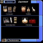
The last created, more sophisticated picture collages from 1997. |
|
3. The origins of the Star Trek Dimension
My first web project
... was not the Star Trek
Dimension, which was a synonym for the LCARS database, the sole project at the that time,
but a Star Trek episode guide for all three (new) series, which was ironically put online
only a few months after my second HTML project, the actual LCARS database, in October
1999.
When I started to program in HTML in early 1997 (first without Frontpage), this was not my
intention anyway. Many people think that HTML is a pure web format. However, for me, it
was an ideal layout utility, which provided much more flexibility and multimedia features
than my own creations (which were restricted to the rigid conventions of an encyclopedia
and did not allow an individual page design). Therefore, I could realize my goal now, that
I had the possibilities. But even before I abandoned the "TrekWorld" project, I
wanted to combine the three episode guides, which I had created as encyclopedias between
1996 and 1997, to a web project: the "TrekGuide", which I extended to over 200
episode files. In August 1997, I developed the known LCARS interface style in order to
simplify the access and to make it more realistic, i.e. more Star Trek-like. Because the
HTML design proved very versatile and (with the aid of a website WYSIWYG editor)
easy-to-use, one month later I decided to reuse the LCARS interface for a real LCARS
database, which should be basically structured like the "TrekWorld" project and
should pursue the same goal of a realistic 24th century information source. |
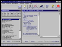
Three episode guides for TNG, DS9, VOY as
enyclopedias as of 1996 ...
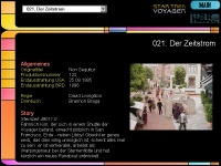
... which reappeared in 1997 as the
"Trek Guide" with HTML design.
|
The first LCARS files
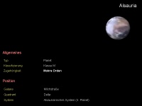 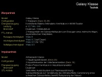
|
Also in September 1997, I had
discovered a new "toy", which was virtually predestined for the new web project:
a rendering program, with which I could create three-dimensional models of the Star Trek
planets, which haven't been seen like this before. Consequently, another goal of the
Dimension was set: to offer new things concerning Star Trek and not to be only a rehash of
former projects. Only some months later, the first files were created "around"
the planet pictures, and the known page structure was created, which, as well as the LCARS
interface, remained nearly unchanged until today, although I now include much more
pictures and full text passages. Finally, the major work for the planetary database
started in February 1998. However, one month earlier, I created the first class
specifications and ship files according to my passion for the starships of Star Trek.
Consequently, gradually a great number of categories and more and more files were
created, which dealt with the cultures, equipment, materials, events, holodeck programs,
persons etc. of Star Trek and also paid attention to new information, e.g. the files about
Star Trek: Insurrection, which were added to the database already in early 1999. |
| Finally, in May 1999, the 250th file
was added to the database; a jubilee that passed silently, since the Star Trek Dimension
was still offline. |
 |
| An overview about the updates done
offline, from January 1st to August 2nd, 1999, which were part of the news file only for a
short time, gives the Star Trek Dimension News of September
1999 (in German!). |
The leap to the global information highway
In Summer 1999, again nothing seemed to
change concerning the "offline existence" of the Star Trek Dimension (and the
LCARS database, respectively). Already, the site was much too large (about 20 MB) for one
of the free webspace providers, and the cryptic URL would have prevented a quick
accessibility. And the professional webspace providers still were much too expensive; a
domain with only a few dozen megabytes space would have costed vast sums per month.
But - thanks to the drop-off of prices - the situation was about to change. In July 1999,
I took the offer of a large German discount provider for 50 MB web space and 2 domains for
a amazing price - and on July 31st, the first files were uploaded, after the LCARS
database and the already existing, so-called "frame program", i.e. the
frontpage, the LCARS history, the FAQ and the quiz, had been made "web-worthy".
After some days of intense upload, the official opening date of the Dimension was August
2nd, 1999. The according (translated) message on the news page was:
Star Trek Dimension finally online
- with own domain www.stdimension.de!
After 2 years of silent
"offline existence", the Star Trek Dimension is online. 2 years ago, this
project started with a few pages about Star Trek, and the goal to put up the ultimate LCARS
database, and now, in contrast to many other just started sites, a whole dimension of
281 LCARS pages with hundreds of photos, diagrams and sounds is already avaiable to you.
|
The creation of the title, the front page and the logo
The title "Star Trek
Dimension" for the LCARS database and the "frame program" together, was
already chosen in June - only, because the title of the predecessor project, "Trek
World", was already taken by the fanzine of a European Star Trek fan club.
Also in this month, a front page was created for the dimension, which "survived"
the online launch with only few corrections and almost remained unchanged until the end of
the year. Because at that time, the LCARS database was the sole project, the front page
had an accordingly simple structure and provided access to all parts of the web project. |
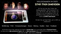

|
| Have a look at the reconstructed and
translated first front page as of August 7th, 1999. |
|
| |
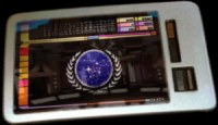
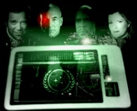
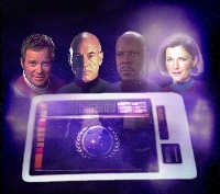
| A major component of the front page was
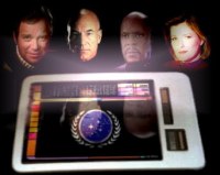
- and is - the logo of the Star Trek Dimension. This logo contains a Starfleet padd which
shows the typical interface of the LCARS database, taking into account that initially,
this project was equal to the entire website. Above the padd, there are the four captains
of the four Star Trek series, what indicates that the Star Trek Dimension pays attention
to all series and all aspects of Star Trek. |

|
|
|
A picture of
one of the captains who became a part of the logo |
Not used
version of the padd, reflecting the most recent Starfleet bridge |
The completed
logo with a significant error that was not fixed until April 2000 |
|
|
|
As well as the frontpage, the logo
remained mainly unchanged until December 1999. While it was improved several times
concerning minor details since then, the present logo still resembles the original
version.
However, an interesting detail should not be forgotten: the final first version contained
an error that I - and fortunately no other person - didn't recognize and that
"survived" all changes of the padd: the picture of Captain Sisko was vertically
flipped for the logo, with the result that his rank pins were on the wrong side of the
collar for over 8 months! Only in April 2000, when the blurred edges of the padd and the
quality of the figures were improved, this error was fixed. By the way, the strange
reflection of the captains in the padd is still in the logo; the special picture for the
first birthday was the first logo which contained a completely redesigned padd that didn't
show this little inconsistency anymore. |

|
| |

|
Two versions -
one error |
|
|
|
| 4. The
development of the design

Design variant #1, as of late 1997 |

Design variant #2, as of early 1999 |
The original design of the Star Trek Dimension,
which you can find nowadays only in the LCARS database and in parts of the ST:VOY and
ST:DS9 guides, was basically developed already in 1997, together with the Trek Guide.
While every episode could be displayed with the LCARS interface that is typical for Star
Trek, a feature that was later re-used in the LCARS database, the files themselves should
use a LCARS-like design as well. Consequently, the color scheme white letters on black
background was used, with magenta as headline color and light-yellow as marker color.
Links were displayed in an unobtrusive light-grey, because of course, the real LCARS
interface.does not show such cross references. When a short time afterwards, the LCARS
database was created, the color scheme of the was re-used together with the interface. At
the beginning of 1999, when the "frame program" of the database was written, the
same design was chosen as well, which remained in all other projects and all newly created
files even after the online launch in August 1999. However, were was an exception: the
technically orientated projects used a different design which was intially created for the
Subspace Manual, a project that originally wasn't part of the Star Trek Dimension and that
was written until Juli 1999. The key colors were light-blue and grey, following the first
"Trek World" projects. These colors were also used for the Star Trek
Cartography, so that in late 1999, after the Subspace Manual was added as a project, the
Dimension had two opposing color schemes.

Design variant #3, as of early 2000 |
|
In order to give the Star Trek Dimension a uniform
design and to create a contrast between the newly created projects, which dealt with the
background of Star Trek, and the LCARS database, which was designed to be a terminal of
the 24th century, in february 2000, a new design was developed. Originally, this design
was created exclusively for the rewritten version of the Star Trek Cartography, therefore
it was based on the Cartography color scheme. Following variant one, however, a greater
number of key colors for text, headlines and links were introduced, which are all
different shades of blue and lilac. In the new Cartography, this color combination looked
both serious and "noble", on the other hand, it was also fresh and
eye-protecting because the contrast between fore and background color is smaller now. That
is why it was finally used for all projects and all files of the Dimension, partly
together with a more sophisticated and interesting background pattern. Only the LCARS
database kept the original design, because it rather resembles the LCARS color scheme.
| However, there was yet another reason
for the design change in early 2000: in preparation of the year 2000 special, in December
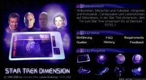
1999, the former "login page" was replaced by a new front page that considerably
differed from the original version. While the latter one had a relatively simple structure
and showed a logo, the links to the frame files of the Star Trek Dimension (the news and
project pages, for example) and an animated news banner in its final version, the new
front page should be still more the "control center" of the website and
therefore have a greater number of facts and references. |

Die letzte Version der Login-Seite (Nov. 1999)
|

Such animated gifs were used as news banners on
the login page for several months.
|

This banner was created, but not used, since it
would have resulted in longer download times.
|
The development of the new design took several weeks, since there was the danger that the
new front page would look too cluttered and confused and the simple operation of the
original page would be consequently lost. On the one hand, the Star Trek Dimension logo
should remain the dominating component of the front page, but on the other hand, also an
introduction text, links for the frame files and the projects, the last news and copyright
information should be integrated.
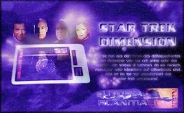
Never used study of the frontpage, which failed
because of the long download time of the pictures. |
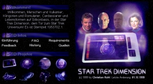
This study shows the design of the final
frontpage, however, it still does not have any frames.
|
| |
|
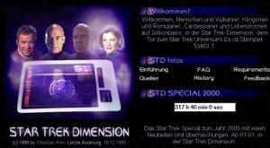
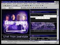
| In the end, the solution of the problem
was a vertical, but invisible division of the front page into one immoveable logo frame
and one vertically scrollable action frame, which contained the introduction text, the
links, the news etc. within several sections. A short time before christmas 1999, the
development of the front page was finally completed and the final version was published. |
 |
| However, with the new frontpage, yet
another design was added to the website that used different shades of purple, reinforcing
the color confusion. With the new appearance of the Dimension, that was introduced in
February 2000, the front page was redesigned for the last time. It is still used without
considerable changes of the structure or color scheme. |
|
| |
|
 |
However, that does not mean, that the
present front page is completely identical to the initial version. For special occasions,
for instance the year 2000 or the first birthday, the design was temporarily altered, and
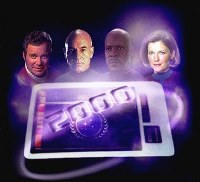
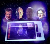
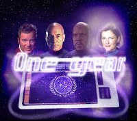
several times since its creation in December 1999, the logo that was created together with
the new front page has been improved or replaced by special versions. |
|
|
 |
 |
 |
| The original logo (July 1999) |
Never used special version (Nov.
99) |
The logo of the new front page
(Dec. 99) |
|
|
|
 |
 |
 |
| The Millennium logo (Jan. 2000) |
Improved version, as of April
2000 |
Logo for the first birthday
(Aug. 2000) |
|
|
| How the last paragraph has proven, in
the end, the design of a website can be as complex as its content. Even though the latter
one will be always more important than the appearance, a persuasive, functional, exciting,
but also not too obtrusive design should be all part of it. However, the designing process
of the Star Trek Dimension is far from completed. The first twelve months have shown how
improvable it can be, and undoubtedly, the appearance of the Dimension will be altered in
the future, or at least further improved. |
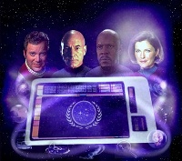
The most recent logo, as of August 2000 |
|